Logo Game: http://www.sporcle.com/games/g/corplogos
12 Things to consider when designing LOGO…..
1. PRELIMINARY WORK IS A MUST
Preliminary sketches are an important first step in designing an effective logo.
2. CREATE BALANCE
Balance is important in logo design because our minds naturally perceive a balanced design as being pleasing and appealing. Keep your logo balanced by keeping the “weight” of the graphics, colors, and size equal on each side.
3. SIZE MATTERS
When it comes to logo design, size does matter. A logo has to look good and be legible at all sizes. A logo is not effective if it loses too much definition when scaled down for letterheads, envelopes, and small promotional items. The logo also has to look good when used for larger formats, such as posters, billboards, and electronic formats such as TV and the Web.
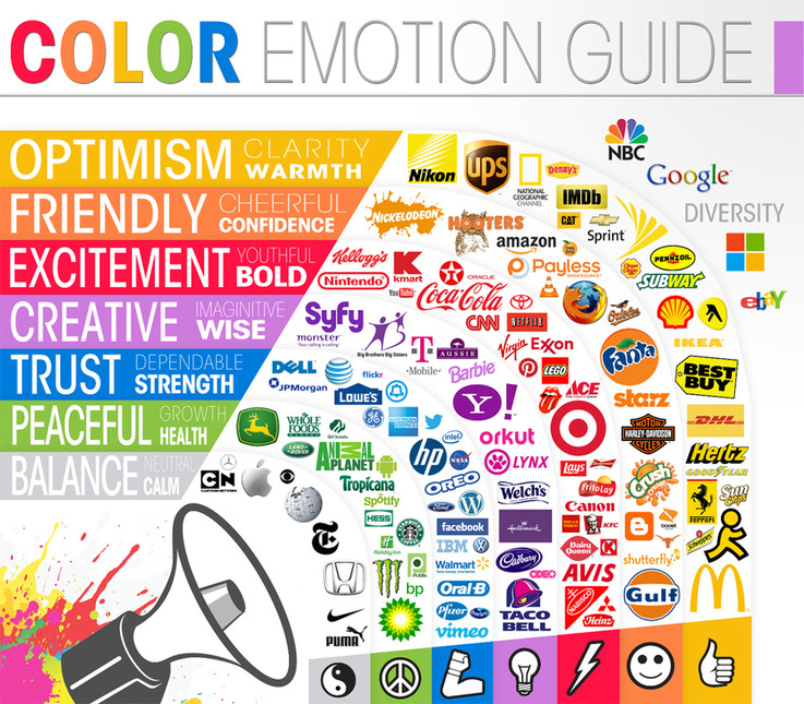
4. CLEVER USE OF COLOR
Color theory is complex, but designers who understand the basics are able to use color to their advantage. The basic rules to keep in mind are:
You can use various design styles when creating a logo, and to pick the right one, you should have some background information about the client and the brand.
Research your client and its audience before you begin your preliminary work.
6. TYPOGRAPHY MATTERS… A LOT!
Choosing the right font type and size is much more difficult than many beginner designer realize. Try both serif fonts and sans-serif fonts as well as script, italics, bold, and custom fonts.
Consider three main points when choosing a font to accompany your logo design:
The whole point of creating a logo is to build brand recognition.
The key to making a popular and recognizable logo is to combine all of the elements discussed:
size, style, color, typography, and originality.
8. DARE TO BE DIFFERENT
To stand out from the competition, you must distinguish yourself as a designer with a distinct style.
Try breaking the rules of design and taking risks.
9. K.I.S.S. (KEEP IT SIMPLE, STUPID)
The simpler the logo, the more recognizable it will be.
For example, the Nike swoosh is an extremely simple logo and is also one of the most recognizable in the world.
10. GO EASY ON EFFECTS
Adobe Illustrator, Freehand, Photoshop, and other graphic design programs are extremely powerful tools and have many filters and effects that you can apply to your logo, but don’t get carried away!
Simplicity is key.
11. DEVELOP A DESIGN “ASSEMBLY LINE”
To produce consistently high-quality logos, you need to develop your own design process, or “assembly line.” This should include the following steps:
Do not copy someone else’s design!
Preliminary sketches are an important first step in designing an effective logo.
2. CREATE BALANCE
Balance is important in logo design because our minds naturally perceive a balanced design as being pleasing and appealing. Keep your logo balanced by keeping the “weight” of the graphics, colors, and size equal on each side.
3. SIZE MATTERS
When it comes to logo design, size does matter. A logo has to look good and be legible at all sizes. A logo is not effective if it loses too much definition when scaled down for letterheads, envelopes, and small promotional items. The logo also has to look good when used for larger formats, such as posters, billboards, and electronic formats such as TV and the Web.
4. CLEVER USE OF COLOR
Color theory is complex, but designers who understand the basics are able to use color to their advantage. The basic rules to keep in mind are:
- Use colors near to each other on the color wheel (e.g. for a “warm” palette, use red, orange, and yellow hues).
- Don’t use colors that are so bright that they are hard on the eyes.
- The logo must also look good in black and white, grayscale, and two colors.
You can use various design styles when creating a logo, and to pick the right one, you should have some background information about the client and the brand.
Research your client and its audience before you begin your preliminary work.
6. TYPOGRAPHY MATTERS… A LOT!
Choosing the right font type and size is much more difficult than many beginner designer realize. Try both serif fonts and sans-serif fonts as well as script, italics, bold, and custom fonts.
Consider three main points when choosing a font to accompany your logo design:
- Strongly consider a custom font for your design.
- The more original the font, the more it will distinguish the brand.
- Examples of successful logos that have a custom font are Yahoo!, Twitter, and Coca Cola
The whole point of creating a logo is to build brand recognition.
The key to making a popular and recognizable logo is to combine all of the elements discussed:
size, style, color, typography, and originality.
8. DARE TO BE DIFFERENT
To stand out from the competition, you must distinguish yourself as a designer with a distinct style.
Try breaking the rules of design and taking risks.
9. K.I.S.S. (KEEP IT SIMPLE, STUPID)
The simpler the logo, the more recognizable it will be.
For example, the Nike swoosh is an extremely simple logo and is also one of the most recognizable in the world.
10. GO EASY ON EFFECTS
Adobe Illustrator, Freehand, Photoshop, and other graphic design programs are extremely powerful tools and have many filters and effects that you can apply to your logo, but don’t get carried away!
Simplicity is key.
11. DEVELOP A DESIGN “ASSEMBLY LINE”
To produce consistently high-quality logos, you need to develop your own design process, or “assembly line.” This should include the following steps:
- Research
- Brainstorm and generate ideas
- Preliminary sketches
- Develop vector designs
- Send to client
- Add or remove anything the client wants
- Finalize the design and re-submit to client
Do not copy someone else’s design!
